
Project Overview
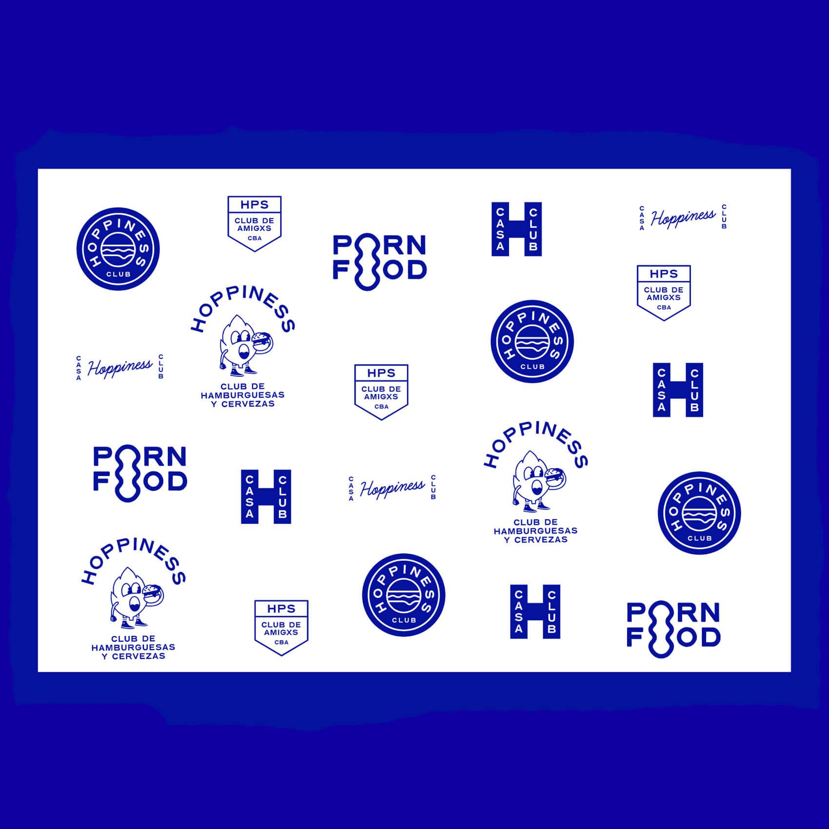
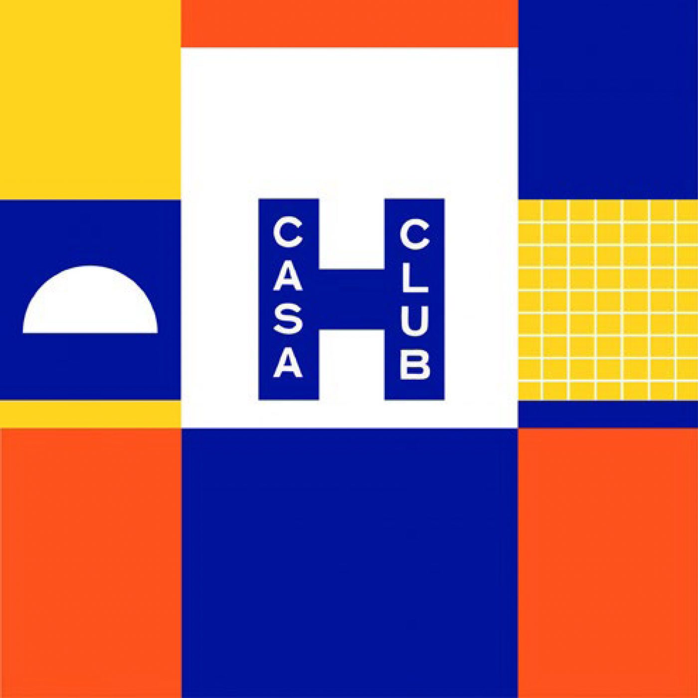
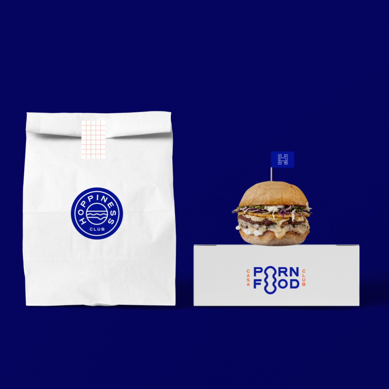
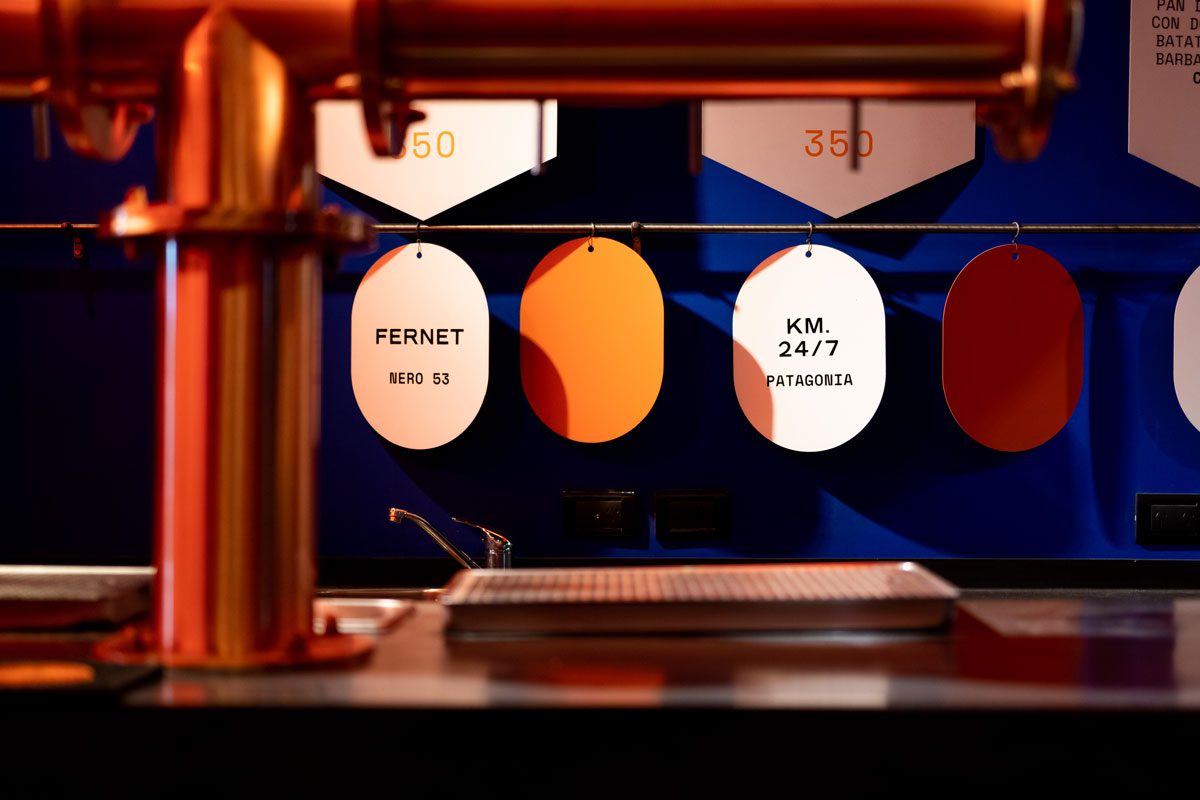
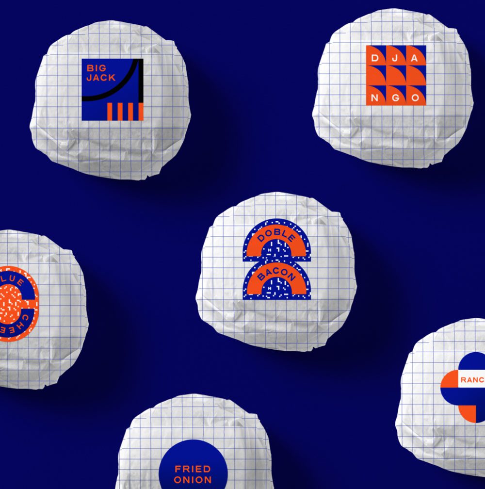
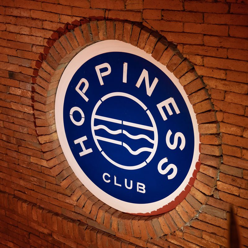
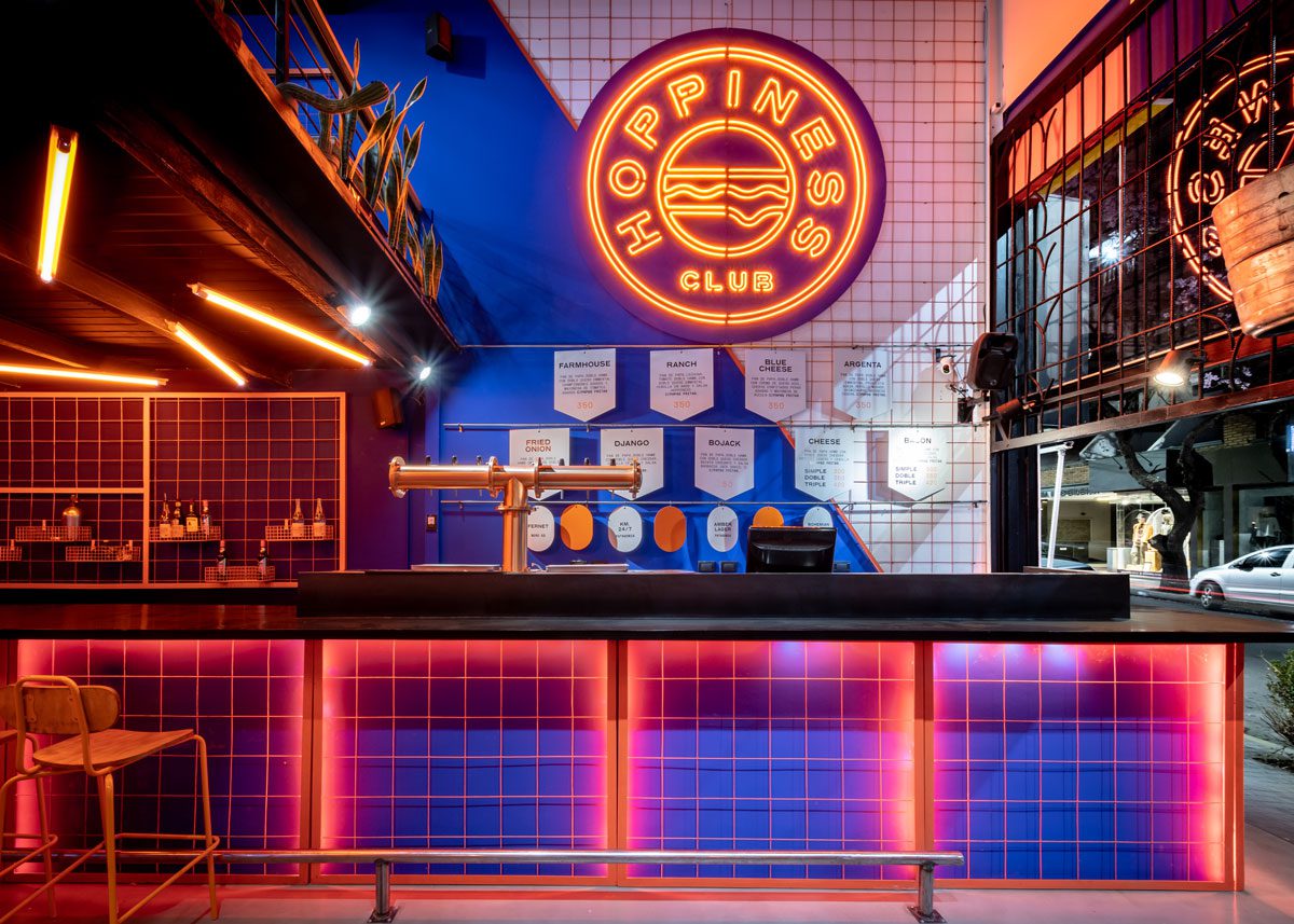
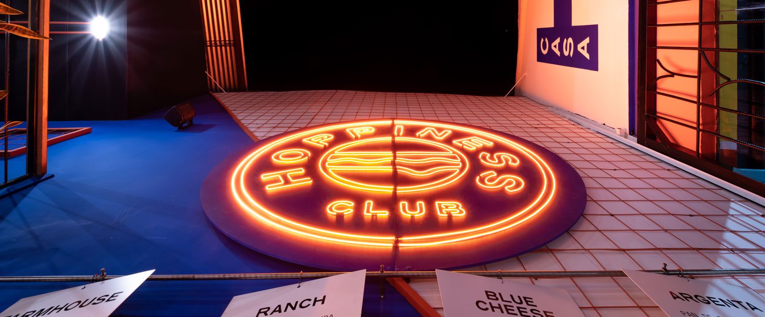
The concept and identity for Hoppiness were based in the eighties. Vibrant colors and eccentric geometries, and the rebelliousness of that period are the protagonist. Our task was to carry out the re-styling of a commercial premise: the business started as a brewery, and the public started choosing the brand because of its burgers. That resulted in giving a functional and aesthetic turn to spaces. Their customers became such regular clients that it began to operate as a friends club. To make the idea of a club stronger, we chose the colors representing it from now on: Blue and Orange. The latter is applied to materials such as pipes and meshes. The former is applied in plains such as walls and extensive areas.